Client:
Project: Brand design
Year: 2022
Services: Brand design, Print design, Visual identity
Brand design
Zlatka
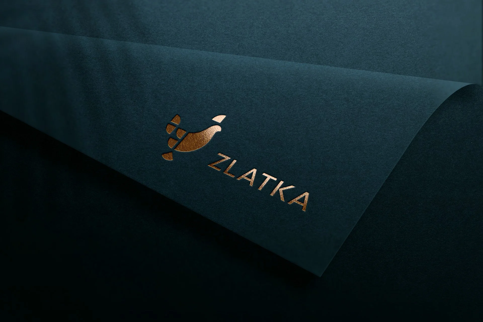
In our endeavor to design a logo for traditional Slovenian souvenirs, we drew inspiration from Slovenia's unique shape, which resembles that of a chicken. Thus, the logo takes on a charming chicken-shaped design, encapsulating the essence of Slovenia's identity. This harmonious representation not only celebrates the country's distinct form but also infuses a playful and memorable touch to the traditional souvenirs, fostering a strong connection with the rich Slovenian heritage.
The logo portrays a slender chicken-shaped icon with a lively tail, symbolizing Zlatka's vibrant temperament. Her elegant demeanor and sophistication embody her status as an urban queen, rooted in traditional knowledge. The logo features linear typography that exudes modernity and timelessness, showcasing clear, distinct, and legible letters, creating a harmonious and refined visual impression.


